A New Learning Platform
Duration: 5 Weeks
Team Size: 3 People
-
What do the people want?
Survey says: It is difficult to keep motivation while learning online
Refreshed our user personas to accurately portray our users
Next step: Get some designs down on paper and figure out the content

-
What are we going to put on here?
Step One: Getting all of our ideas out, as wacky as they might have been and organizing them to figure out what me must and should have
The Results: In order to keep users motivated and feeling good about learning, we decided to include an accomplishments tracker and visible but locked course content depending on progress.
The Goal: Success will be calculated by how users feel about the included features and if they feel it will help them stay motivated to continue learning on our site.

-
How is it going to look?
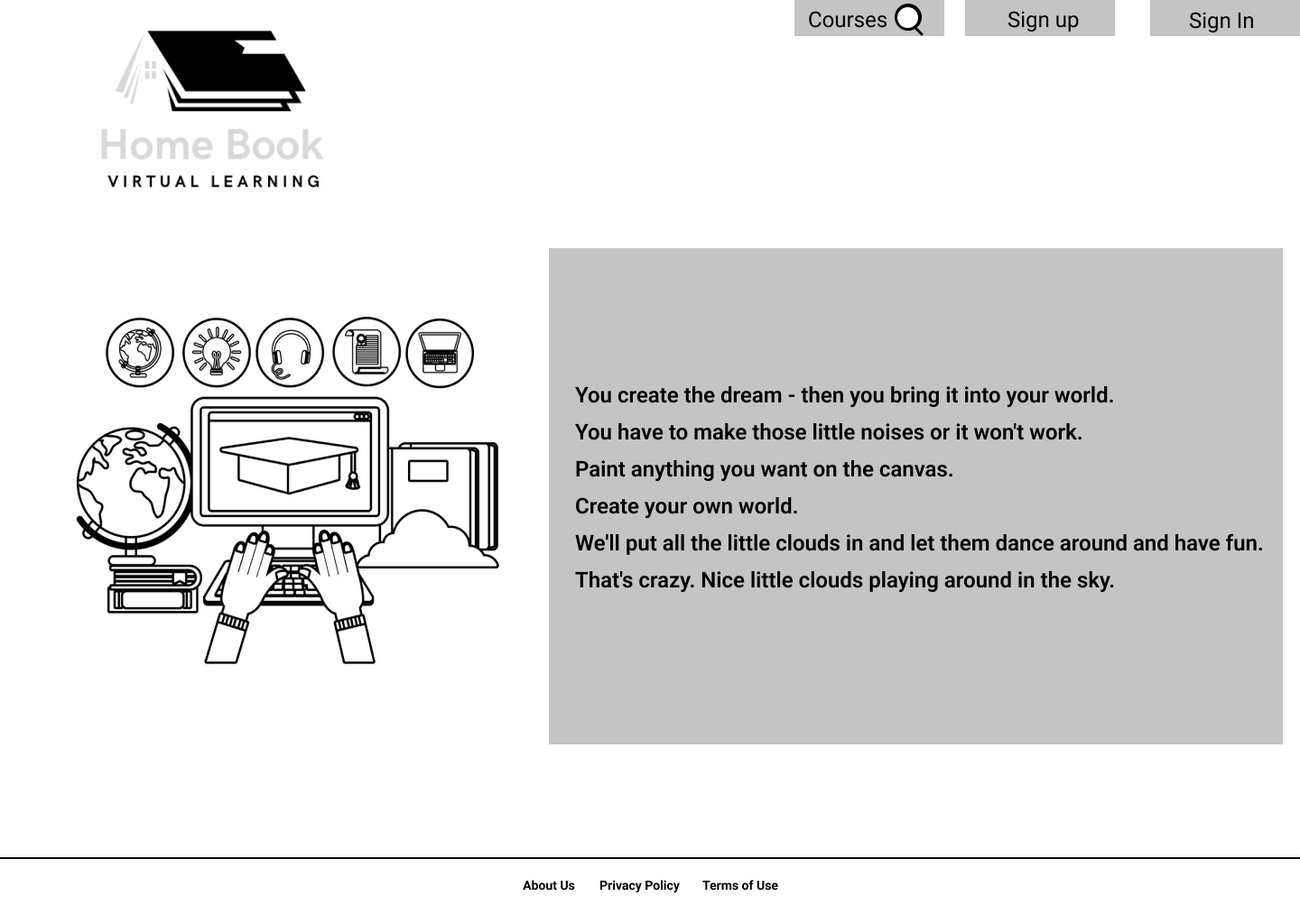
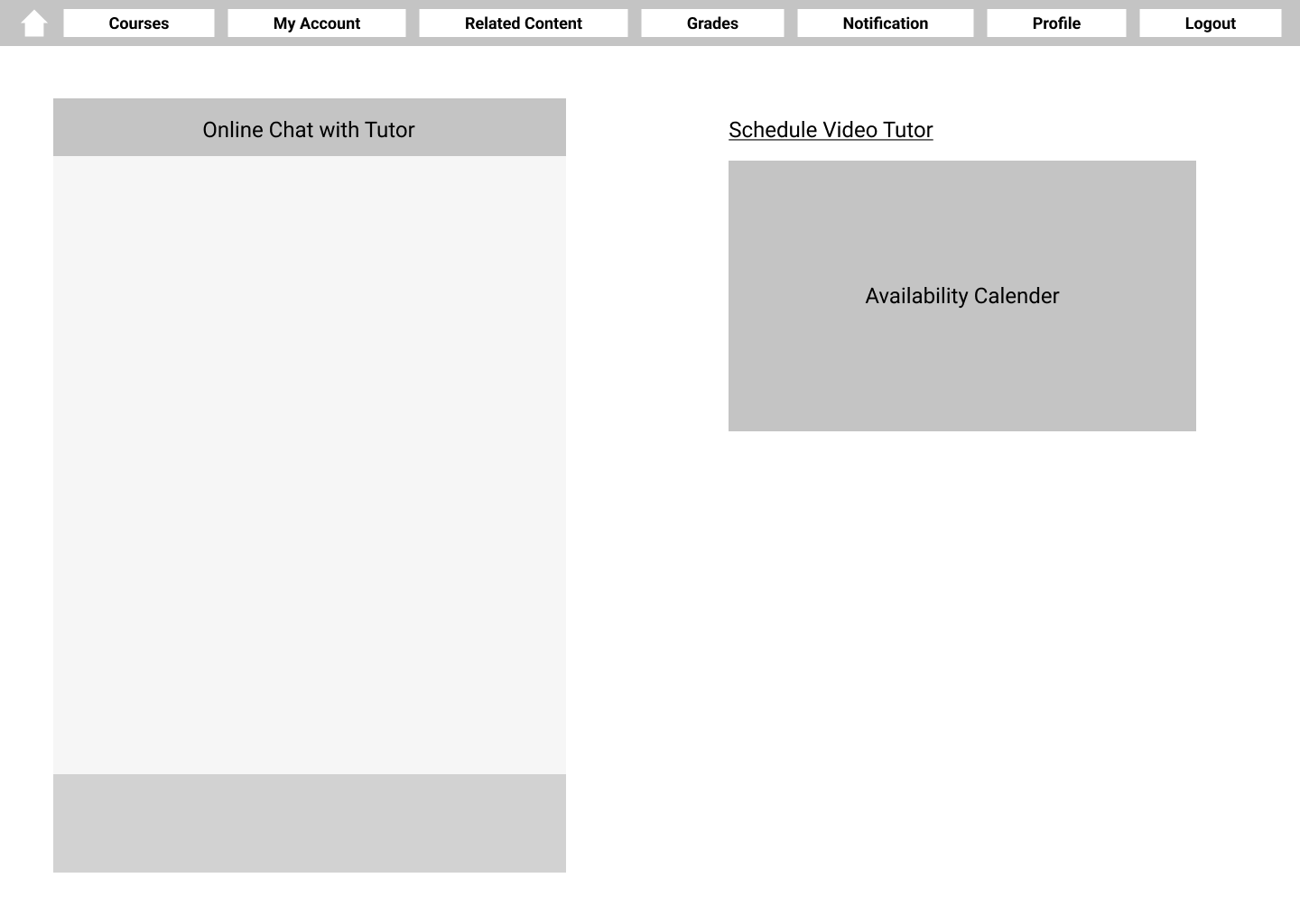
Starting with our user journey, we decided on 10 frames to design to cover all of our bases.
Up next is one of my personal favorites of the design process…the wireframing. It started with the lowest fidelity, just a framework of how everything would be. Then came the iterations…and iterations…and more iterations until we had a design that felt consistent with our goals.

-
Final Design and Testing
Filling in our initial wireframes with images, filler text, a full nav bar, and making it functionally linked up, we were ready to test our design.
Looking for metrics such as ease of use, the availability of information, and testing our motivational and habit forming aspects, the tests began.
Using moderated and recorded tests with our Figma prototype, we were able to follow our user’s journey and look back on the live commentary, mouse movements, and facial expressions. Once the tests were done we asked follow up questions. Gathering all of this data was important to us to see if our design accomplished what we set out to.

The Final Product


